
How it works
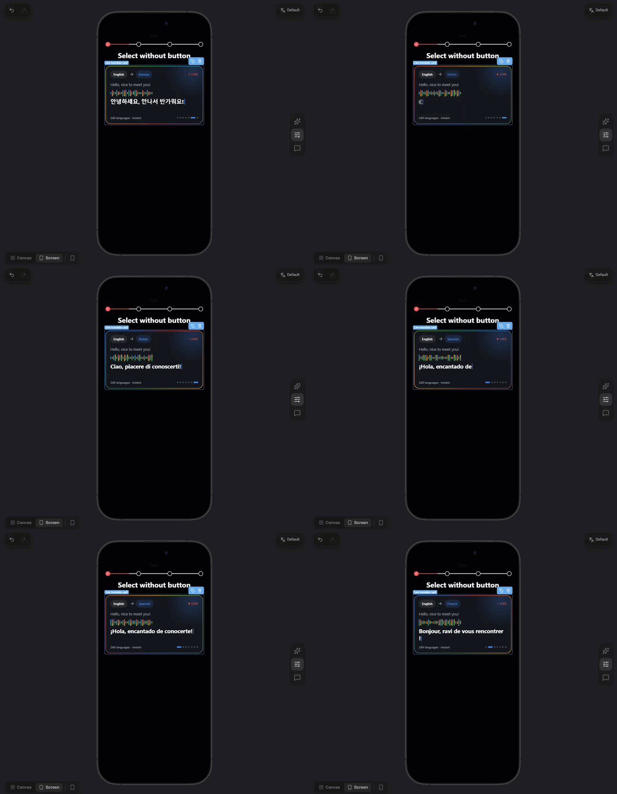
A custom element lets you build anything built-in elements can’t, such as animated buttons, charts, badges, or anything else. You write it once as an HTML fragment, then reuse it on any screen in any funnel of the project. Each save creates a new version (v1, v2…). Funnels keep the version they use until you open them in the editor, save, and publish. Custom elements are available in every project. Anyone who can edit funnels in the project can work with them.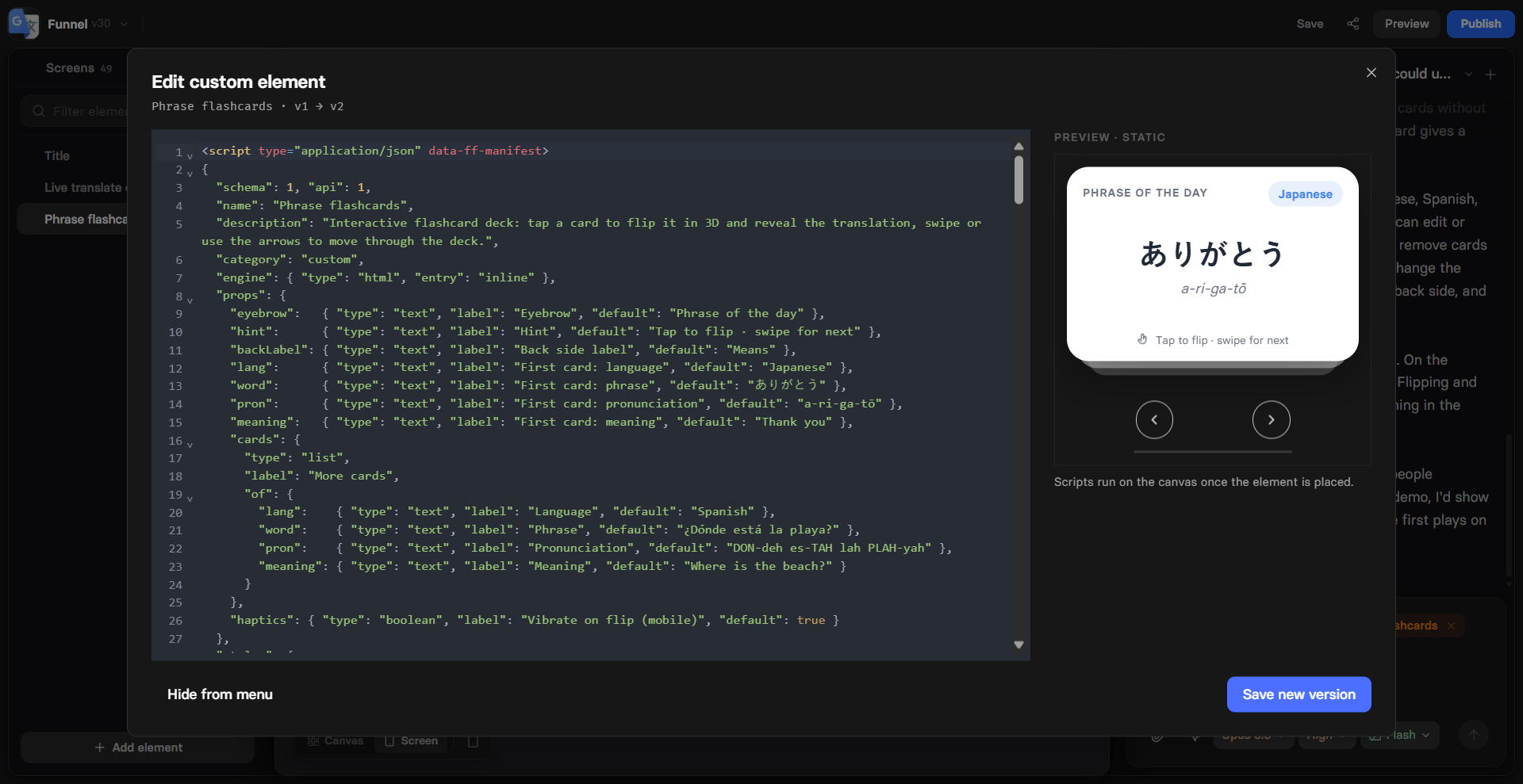
Create custom element
Create custom elements with AI Chat, or write the code yourself. You can also have Claude write the code from this page.- With AI Chat
- Manually or with Claude
1
Open AI Chat
Open AI Chat in Editor
in the selector on the right. In the model
menu, check that Engine is set to v2.
2
Share reference
Attach a reference image
or paste a funnel link.
When no built-in element matches part of it, the agent writes, saves,
and places a custom element for you.Or describe the element, for example
create a custom element that shows a score in a ring.Use custom elements
Prompt AI Chat in Editor to add a custom element by its name. When you rebuild a screen from a reference or a URL, AI Chat reuses your project’s custom elements, or creates new ones when no built-in element matches. Or add them manually:1
Add element
Open the Elements tab on the left, click Add element and go to
Custom. You can also type the element’s name in the search. Click
the element to add it to the current screen.
2
Configure element
Open Properties in the selector on the right and go to the
Parameters tab. Below the common settings, such as ID and
visibility, you see the props declared
in the element’s code.The header of the props section shows:
- Version: The version this element uses, for example v2.
- Update to vN: Appears when the project has a newer version. Click it to move this element to the latest version.
- Edit custom element: The gear icon opens the code editor.
3
Style element
Go to Properties > Styles to adjust the Container section and the
style groups the element declares.
Edit custom element
Open the code editor in one of these ways:- Right-click the element in the Elements tab and select Edit custom element.
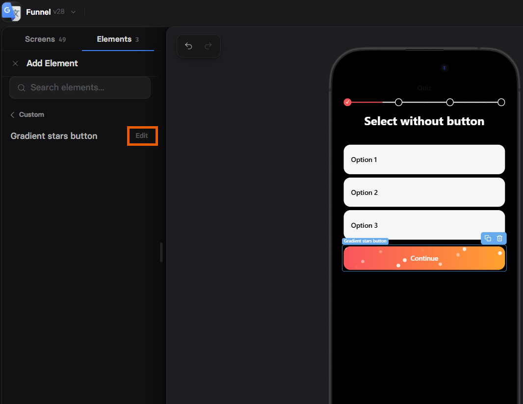
- Click Edit next to the element in Add element > Custom.
Migration steps
configholds the element’s props.ctx.move()renames a prop and moves its translations.- Steps run only in the editor, when a funnel moves to the new version. They
can’t use
ff, the page, timers, or the network.
Versioning
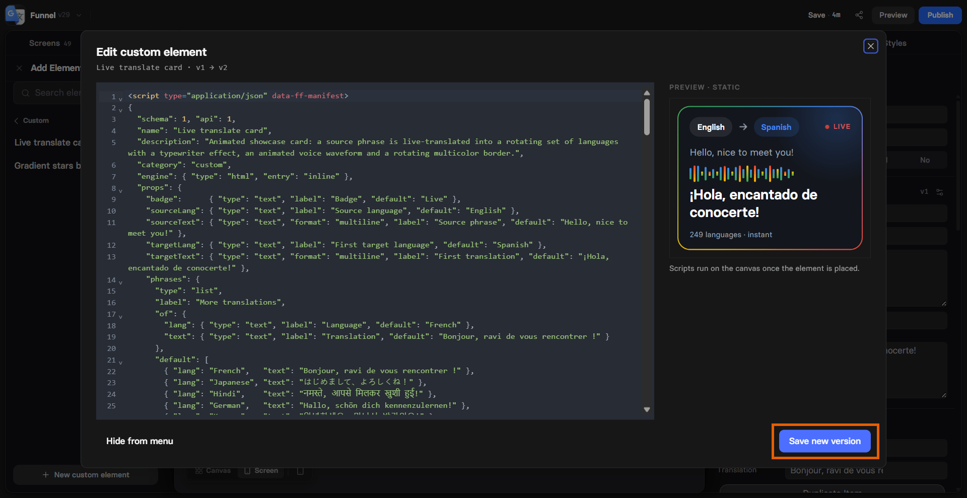
Saving a new version doesn’t change any funnel. For example, a published funnel uses v1 and you save v2:- The live funnel stays on v1.
- You open the funnel in the editor: Its elements switch to v2 automatically, as an unsaved change. The live funnel is still on v1.
- You save and publish the funnel: The live funnel switches to v2.
Manage custom elements
Custom elements can’t be deleted. To hide one from your elements selector, open the code editor and click Hide from menu. The element disappears from the Add element menu, but funnels that already use it keep showing it. To offer it again, click Show in menu.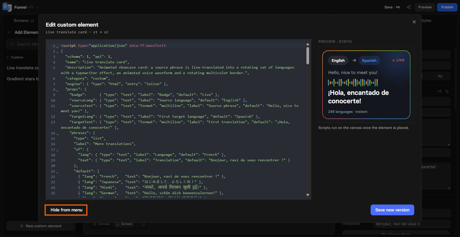
Custom element localization
Text props of custom elements are translated together with the rest of the funnel. Learn about localizations.textprops: Translated like texts of built-in elements.assetprops: Can be changed per language, but aren’t translated automatically.textprops with theidoremojiformat: Never translated.
Custom elements reference
Fragment structure
A custom element is one HTML fragment with up to four parts:
The starter code in the code editor declares one text prop, Label, and
shows its value:
Starter code
Manifest
string
The element’s name in the Add element menu and the Elements tab.
object
Optional style settings in Properties > Styles. See
Style groups.
schema, api, category, engine, and ssr as they are in the
starter code.
Props
Each prop is a key underprops with a type, a label shown in
Properties, and a default value:
For an
action prop, write "default": "navigate" to navigate to the next
screen by default. Any other default action needs the full action object.
Bindings
Bindings connect props to the markup and CSS. FunnelFox applies them before any script runs and again every time a prop changes. Every prop a binding names must be declared in the manifest.Scripts
Each<script> runs once after the markup appears. Scripts run on the
published funnel and on the editor canvas, but not in the preview of the code
editor. When you change a prop, the element renders again and its scripts run
again.
object
The element’s own root. Look up nodes with
root.querySelector() instead
of document.object
Every prop, with its default filled in and its text already translated.
string
live on the published funnel, editor on the canvas.ff offers only ff.element and ff.mode. Scripts can’t
save replies, set variables, navigate, or send events through ff. Use an
action prop with data-ff-action to navigate.
FunnelFox clears the timers (setTimeout, setInterval,
requestAnimationFrame) and window event listeners a script added when the
element is removed.
Style groups
The Styles tab shows the Container section for every custom element. To add your own style settings, declare a style group understyles in the
manifest:
number, enum, color, or boolean. Each field
becomes a CSS variable named --s-<group>-<field>, so the example above gives
var(--s-card-radius).
Restrictions
These block the save with an error:- Load scripts with
<script src>or<script type="module">. - Make network requests with
fetch,XMLHttpRequest, orsendBeacon. - Use
import(),eval, ornew Function. - Use
javascript:URLs or CSS@import. - Use
fffeatures other thanff.elementandff.mode. - Exceed 64 KB of source code.
- Inline event handlers, such as
onclick. <link>,<meta>,<title>, and<base>tags.
fox (the Fox API) trigger a warning.
Rich text and HTML text props, external libraries, and elements that hold
other elements aren’t supported. The code editor names the unsupported part
when you use one.
Existing snippets
Only the markup is required, so you can paste an existing HTML widget as is. FunnelFox adds a manifest automatically and replaces{{variable}}
placeholders in the markup, as Raw HTML does. A snippet
without a manifest has no settings in Properties and no translatable
texts.
Example
A full-width button with a two-color gradient and twinkling stars. It has six props: a label, two gradient colors, the number of stars, the twinkle speed, and the action to run on press.Gradient stars button